Bun venit
Acesta este website-ul ce acompaniază cursurile Introducere în Neuroștiințe și Neuroștiințe Cognitive și Clinice din cadrul Facultății de Psiholgie și Științele Educației, Universitatea din București.


Hugo uses Markdown for its simple content format. However, there are a lot of things that Markdown doesn’t support well. You could use pure HTML to expand possibilities.
But this happens to be a bad idea. Everyone uses Markdown because it’s pure and simple to read even non-rendered. You should avoid HTML to keep it as simple as possible.
To avoid this limitations, Hugo created shortcodes. A shortcode is a simple snippet inside a page.
The Relearn theme provides multiple shortcodes on top of existing ones.
Claudiu C. Papasteri Dr. Claudiu C. Papasteri este psiholog clinician, psihoterapeut și lector universitar în cadrul Departamentului de Psihologie și Știinte Cognitive, Facultatea de Psihologie și Științele Educației, Universitatea din București. Format în psihoterapie experiențială, focalizată pe emoții și ericksoniană, studiile lui anterioare au vizat dezvoltarea și targetarea intervențiilor psihologice, și cercetarea proceselor de psihoterapie. Mai recent a devenit interesat de substratul fiziologic modificărilor ce survin prin patogeneză, dar și în urma psihoterapiei de succes.
Săptămâna Data Subiect Lectură Video Prezentări Activități 1 04.10 Neuroștiințele și științele cognitive: niveluri de analiză și paradigme de cercetare; Neuronii și celulele gliale 📖 (Bermúdez, 2020 – Intoduction; Bear et al., 2016 – Ch1 & Ch2) 📺 🖥️ 📋 2 11.10 Proprietățile electrice ale neuronului: Potențialul de membrană 📖 (Bear et al., 2016 – Ch3) 3 18.10 Proprietățile electrice ale neuronului: Potenţialul de acţiune 📖 (Bear et al., 2016 – Ch4) 4 25.

Dr. Claudiu C. Papasteri este psiholog clinician, psihoterapeut și lector universitar în cadrul Departamentului de Psihologie și Știinte Cognitive, Facultatea de Psihologie și Științele Educației, Universitatea din București. Format în psihoterapie experiențială, focalizată pe emoții și ericksoniană, studiile lui anterioare au vizat dezvoltarea și targetarea intervențiilor psihologice, și cercetarea proceselor de psihoterapie. Mai recent a devenit interesat de substratul fiziologic modificărilor ce survin prin patogeneză, dar și în urma psihoterapiei de succes. Principalele sale domenii de cercetare îmbină psihologia clinică, psihoterapia și electropsihofiziologia cu pasiunea sa pentru programare statistică și psihometrie.

Ana Toma este psiholog, student-doctorand și asistent universitar doctorand la Facultatea de Psihologie și Științele Educației, Universitatea din București. Ana este specializată în psihoterapie cognitiv-comportamentală și psihologie clinică și urmează în prezent cursuri de formare în psihoterapia focalizată pe emoții. Ca cercetător, Ana se centrează pe psihologia cuplului în cadrul tezei de doctorat, fiind de asemenea interesata de neuroștiința cogniției sociale. Pe lângă neuroștiințe, activitatea de predare include subiecte precum psihoterapia și statistica în științele sociale.
| Săptămâna | Data | Subiect | Lectură | Video | Prezentări | Activități |
|---|---|---|---|---|---|---|
| 1 | 04.10 | Neuroștiințele și științele cognitive: niveluri de analiză și paradigme de cercetare; Neuronii și celulele gliale | 📖 (Bermúdez, 2020 – Intoduction; Bear et al., 2016 – Ch1 & Ch2) | 📺 | 🖥️ | 📋 |
| 2 | 11.10 | Proprietățile electrice ale neuronului: Potențialul de membrană | 📖 (Bear et al., 2016 – Ch3) | |||
| 3 | 18.10 | Proprietățile electrice ale neuronului: Potenţialul de acţiune | 📖 (Bear et al., 2016 – Ch4) | |||
| 4 | 25.10 | Proprietățile electrice ale neuronului: Transmisia sinaptică | 📖 (Bear et al., 2016 – Ch5) | |||
| 5 | 01.11 | Proprietățile electrice ale creierului, electroencefalograma și electrofiziologia periferică | 📖 (Ward, 2016 – Ch3) | |||
| 6 | 08.11 | Sistemele de neurotransmițători | 📖 (Bear et al., 2016 – Ch6) | ✍️ | ||
| 7 | 15.11 | Structura sistemului nervos: neuroanatomie | 📖 (Bear et al., 2016 – Ch7) | |||
| 8 | 22.11 | Sistemele senzorial și motor | 📖 (Bear et al., 2016 – Ch8-Ch14) | |||
| 9 | 29.11 | Creierul în repaus, atenția și conștiința | 📖 (Bear et al., 2016 – Ch21) | |||
| 10 | 06.12 | Undele celebrale și solumnul | 📖 (Bear et al., 2016 – Ch19) | |||
| 11 | 13.12 | Mecanismele cerebrale ale emoției | 📖 (Bear et al., 2016 – Ch18) | |||
| 12 | 20.12 | Tulburările mentale | 📖 (Bear et al., 2016 – Ch22) | |||
| 13 | 27.12 | Criteriile domeniului de cercetare (Research Domain Criteria - RDoC) | 📖 | |||
| 14 | Suplimentar | Neuroștiințe computaționale, conexionismul și inteligența artificială: modelarea sinapselor, perceptronul și rețelele neurale artificiale | 📖 (Bermúdez, 2020 – Part II 5) | |||
| Examen | Stabilit | ✍️ |
Bear, M., Connors, B., & Paradiso, M. A. (2016). Neuroscience: exploring the brain (4th Ed.). Jones & Bartlett Learning.
Bermúdez, J. L. (2020). Cognitive science: An introduction to the science of the mind. Cambridge University Press.
Ward, J. (2019). The Student’s Guide to Cognitive Neuroscience. Routledge.
This is a demo child page with no description.
So its content is used as description.
Discover what this Hugo theme is all about and the core-concepts behind it.
Aici puteți găsi activități de seminar și pentru lucru acasă.
Find out how to create and organize your content quickly and intuitively.
Let’s face it: Writing content for the web is tiresome. WYSIWYG editors help alleviate this task, but they generally result in horrible code, or worse yet, ugly web pages.
Markdown is a better way to write HTML, without all the complexities and ugliness that usually accompanies it.
Some of the key benefits are:
John Gruber, the author of Markdown, puts it like this:
The overriding design goal for Markdown’s formatting syntax is to make it as readable as possible. The idea is that a Markdown-formatted document should be publishable as-is, as plain text, without looking like it’s been marked up with tags or formatting instructions. While Markdown’s syntax has been influenced by several existing text-to-HTML filters, the single biggest source of inspiration for Markdown’s syntax is the format of plain text email. John Gruber
Without further delay, let us go over the main elements of Markdown and what the resulting HTML looks like:
Bookmark this page and the official Commonmark reference for easy future reference!
In Markdown your content usually spans the whole available document width. This is called a block. Blocks are always separated by whitespace to their adjacent blocks in the resulting document.
Any text not starting with a special sign is written as normal, plain text paragraph block and must be separated to its adjacent blocks by empty lines.
Lorem ipsum dolor sit amet, graecis denique ei vel, at duo primis mandamus.
Et legere ocurreret pri, animal tacimates complectitur ad cum. Cu eum inermis inimicus efficiendi. Labore officiis his ex, soluta officiis concludaturque ei qui, vide sensibus vim ad.Lorem ipsum dolor sit amet, graecis denique ei vel, at duo primis mandamus.
Et legere ocurreret pri, animal tacimates complectitur ad cum. Cu eum inermis inimicus efficiendi. Labore officiis his ex, soluta officiis concludaturque ei qui, vide sensibus vim ad.
A good idea is to structure your content using headings and subheadings. HTML-headings from h1 through h6 are constructed with a # for each level.
In Hugo you usually don’t use h1 as this is generated by your theme and you should only have one such element in a document.
# h1 Heading
## h2 Heading
### h3 Heading
#### h4 Heading
##### h5 Heading
###### h6 HeadingTo further structure your content you can add horizontal rules. They create a “thematic break” between paragraph blocks. In Markdown, you can create it with three consecutive dashes ---.
Lorem ipsum dolor sit amet, graecis denique ei vel, at duo primis mandamus.
---
Et legere ocurreret pri, animal tacimates complectitur ad cum. Cu eum inermis inimicus efficiendi. Labore officiis his ex, soluta officiis concludaturque ei qui, vide sensibus vim ad.Lorem ipsum dolor sit amet, graecis denique ei vel, at duo primis mandamus.
Et legere ocurreret pri, animal tacimates complectitur ad cum. Cu eum inermis inimicus efficiendi. Labore officiis his ex, soluta officiis concludaturque ei qui, vide sensibus vim ad.
You can show importance of a snippet of text with a heavier font-weight by enclosing it with two asterisks **.
I am rendered with **bold text**I am rendered with bold text
You can emphasize a snippet of text with italics by enclosing it with underscores _.
I am rendered with _italicized text_I am rendered with italicized text
In GFM (GitHub Flavored Markdown) you can do strikethroughs by enclosing text with two tildes ~~.
~~Strike through this text~~Strike through this text
This Markdown dialect supports an extension to combine multiple punctuation characters to single typographic entities. This will only be applied to text outside of code blocks or inline code.
Double quotes `"` and single quotes `'` of enclosed text are replaced by **"double curly quotes"** and **'single curly quotes'**.
Double dashes `--` and triple dashes `---` are replaced by en-dash **--** and em-dash **---** entities.
Double arrows pointing left `<<` or right `>>` are replaced by arrow **<<** and **>>** entities.
Three consecutive dots `...` are replaced by an ellipsis **...** entity.Double quotes " and single quotes ' of enclosed text are replaced by “double curly quotes” and ‘single curly quotes’.
Double dashes -- and triple dashes --- are replaced by en-dash – and em-dash — entities.
Double arrows pointing left << or right >> are replaced by arrow « and » entities.
Three consecutive dots ... are replaced by an ellipsis … entity.
You can write a list of items in which the order of the items does not explicitly matter.
It is possible to nest lists by indenting an item for the next sublevel.
You may use any of -, * or + to denote bullets for each list item but should not switch between those symbols inside one whole list.
- Lorem ipsum dolor sit amet
- Consectetur adipiscing elit
- Vestibulum laoreet porttitor sem
- Ac tristique libero volutpat at
- Nulla volutpat aliquam velit
- Phasellus iaculis neque
- Purus sodales ultricies
- Faucibus porta lacus fringilla velYou can create a list of items in which the order of items does explicitly matter.
It is possible to nest lists by indenting an item for the next sublevel.
Markdown will automatically number each of your items consecutively. This means, the order number you are providing is irrelevant.
1. Lorem ipsum dolor sit amet
3. Consectetur adipiscing elit
1. Integer molestie lorem at massa
7. Facilisis in pretium nisl aliquet
99. Nulla volutpat aliquam velit
1. Faucibus porta lacus fringilla vel
1. Aenean sit amet erat nunc
17. Eget porttitor loremIn GFM (GitHub Flavored Markdown) you can add task lists resulting in checked or unchecked non-clickable items
- [x] Basic Test
- [ ] More Tests
- [x] View
- [x] Hear
- [ ] SmellThis Markdown dialect supports an extension to add definition lists. Definition lists are made of terms and definitions of these terms, much like in a dictionary.
A definition list in Markdown Extra is made of a single-line term followed by a colon and the definition for that term. You can also associate more than one term to a definition.
If you add empty lines around the definition terms, additional vertical space will be generated. Also multiple paragraphs are possible
Apple
: Pomaceous fruit of plants of the genus Malus in the family Rosaceae.
: An American computer company.
Orange
: The fruit of an evergreen tree of the genus Citrus.
You can make juice out of it.
: A telecommunication company.
You can't make juice out of it.You can make juice out of it.
You can’t make juice out of it.
Inline snippets of code can be wrapped with backticks `.
In this example, `<div></div>` is marked as code.In this example, <div></div> is marked as code.
A simple code block can be generated by indenting several lines of code by at least two spaces.
Be impressed by my advanced code:
// Some comments
line 1 of code
line 2 of code
line 3 of codeBe impressed by my advanced code:
// Some comments
line 1 of code
line 2 of code
line 3 of code
If you want to gain more control of your code block you can enclose your code by at least three backticks ``` a so called fence.
In GFM (GitHub Flavored Markdown) you can also add a language specifier directly after the opening fence, ```js, and syntax highlighting will automatically be applied according to the selected language in the rendered HTML.
See Code Highlighting for additional documentation.
```js
grunt.initConfig({
assemble: {
options: {
assets: 'docs/assets',
data: 'src/data/*.{json,yml}',
helpers: 'src/custom-helpers.js',
partials: ['src/partials/**/*.{hbs,md}']
},
pages: {
options: {
layout: 'default.hbs'
},
files: {
'./': ['src/templates/pages/index.hbs']
}
}
}
};
```grunt.initConfig({
assemble: {
options: {
assets: 'docs/assets',
data: 'src/data/*.{json,yml}',
helpers: 'src/custom-helpers.js',
partials: ['src/partials/**/*.{hbs,md}']
},
pages: {
options: {
layout: 'default.hbs'
},
files: {
'./': ['src/templates/pages/index.hbs']
}
}
}
};In GFM (GitHub Flavored Markdown) you can create tables by adding pipes as dividers between each cell, and by adding a line of dashes (also separated by bars) beneath the header. Note that the pipes do not need to be vertically aligned.
| Option | Description |
|--------|-------------|
| data | path to data files to supply the data that will be passed into templates. |
| engine | engine to be used for processing templates. Handlebars is the default. |
| ext | extension to be used for dest files. || Option | Description |
|---|---|
| data | path to data files to supply the data that will be passed into templates. |
| engine | engine to be used for processing templates. Handlebars is the default. |
| ext | extension to be used for dest files. |
Adding a colon on the left and/or right side of the dashes below any heading will align the text for that column accordingly.
| Option | Number | Description |
|-------:|:------:|:------------|
| data | 1 | path to data files to supply the data that will be passed into templates. |
| engine | 2 | engine to be used for processing templates. Handlebars is the default. |
| ext | 3 | extension to be used for dest files. || Option | Number | Description |
|---|---|---|
| data | 1 | path to data files to supply the data that will be passed into templates. |
| engine | 2 | engine to be used for processing templates. Handlebars is the default. |
| ext | 3 | extension to be used for dest files. |
For quoting blocks of content from another source within your document add > before any text you want to quote.
Blockquotes can also be nested.
> Donec massa lacus, ultricies a ullamcorper in, fermentum sed augue. Nunc augue augue, aliquam non hendrerit ac, commodo vel nisi.
>
> > Sed adipiscing elit vitae augue consectetur a gravida nunc vehicula. Donec auctor odio non est accumsan facilisis. Aliquam id turpis in dolor tincidunt mollis ac eu diam.
>
> Mauris sit amet ligula egestas, feugiat metus tincidunt, luctus libero. Donec congue finibus tempor. Vestibulum aliquet sollicitudin erat, ut aliquet purus posuere luctus.Donec massa lacus, ultricies a ullamcorper in, fermentum sed augue. Nunc augue augue, aliquam non hendrerit ac, commodo vel nisi.
Sed adipiscing elit vitae augue consectetur a gravida nunc vehicula. Donec auctor odio non est accumsan facilisis. Aliquam id turpis in dolor tincidunt mollis ac eu diam.
Mauris sit amet ligula egestas, feugiat metus tincidunt, luctus libero. Donec congue finibus tempor. Vestibulum aliquet sollicitudin erat, ut aliquet purus posuere luctus.
In GFM (GitHub Flavored Markdown) absolute URLs will automatically be converted into a link.
This is a link to https://example.com.This is a link to https://example.com.
You can explicitly define links in case you want to use non-absolute URLs or want to give different text.
[Assemble](http://assemble.io)For even further information, you can add an additional text, displayed in a tooltip on hovering over the link.
[Upstage](https://github.com/upstage/ "Visit Upstage!")Links can be simplyfied for recurring reuse by using a reference ID to later define the URL location. This simplyfies writing if you want to use a link more than once in a document.
[Example][somelinkID]
[somelinkID]: https://example.com "Go to example domain"Footnotes work mostly like reference-style links. A footnote is made of two things, a marker in the text that will become a superscript number and a footnote definition that will be placed in a list of footnotes.
Usually the list of footnotes will be shown at the end of your document. If we use a footnote in a notice box it will instead be listed at the end of its box.
Footnotes can contain block elements, which means that you can put multiple paragraphs, lists, blockquotes and so on in a footnote. It works the same as for list items, just indent the following paragraphs by four spaces in the footnote definition.
That's some text with a footnote[^1]
[^1]: And that's the footnote.
That's some more text with a footnote.[^someid]
[^someid]:
Anything of interest goes here.
Blue light glows blue.Images have a similar syntax to links but include a preceding exclamation mark.

Like links, images can also be given a tooltip.

Images can also be linked by reference ID to later define the URL location. This simplyfies writing if you want to use an image more than once in a document.
![La Forge][laforge]
[laforge]: https://octodex.github.com/images/trekkie.jpg "Geordi La Forge"
This theme allows additional non-standard formatting by setting query parameter at the end of the image URL. The default behavior is configurable thru your config.toml or frontmatter parameter.
Add query parameter width and/or height to the link image to resize the image. Values are CSS values (default is auto).


Add a query parameter classes to the link image to add CSS classes. Add some of the predefined values or even define your own in your CSS.


Add the query parameter lightbox=false to the image link to disable the lightbox.

If you want to wrap an image in a link and lightbox=true is your default setting, you have to explicitly disable the lightbox to avoid it to hijacking your link like:
[](https://octodex.github.com/#homercat)
The theme comes with a reasonably configured topbar.
Nevertheless, your requirements may differ from this configuration. Luckily the theme got you covered as the themebar, its buttons and the functionality behind these buttons is fully configurable by you.
All mentioned file names below can be clicked and show you the implementation for a better understanding.
The default configuration comes with three predefined areas that may contain an arbitrary set of buttons.
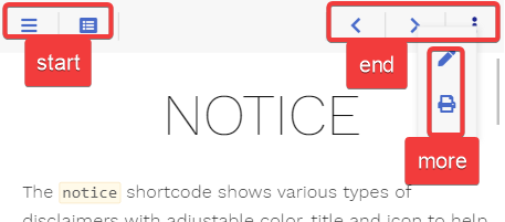
While you can not add additional areas in the topbar, you are free to configure addtional buttons that behave like the more button, providing further user defined areas.
The theme ships with the following predefined buttons (from left to right in the screenshot)
editURL parameter is setNot all buttons are displayed at every given time. This is configurable (see below if interested).
Each predefined area and button comes in their own file. By that it is easy for you to overwrite an area file in your installation reusing only the buttons you like.
Eg. you can redefine the predefined end area by adding the file layouts/partials/topbar/area/end.html in your installation (not in the theme itself) to remove all but the more button.
The below example sets an explicit value for the onempty parameter, overriding the specific default value for this button (these defaults vary depending on the button). The parameter causes the more button to always be displayed instead of hiding once its content is empty.
{{ partial "topbar/button/more.html" (dict
"page" .
"onempty" "disable"
)}}The theme distingushies between two types of buttons:
Depending on the screen width you can configure how the button should behave. Screen width is divided into three classes:
onwidths parameter) mobile layout where the menu sidebar is hiddenonwidthm parameter) desktop layout with visible sidebar while the content area width still resizesonwidthl parameter) desktop layout with visible sidebar once the content area reached its maximum widthFor each width class, you can configure one of the following actions:
show: the button is displayed in its given areahide: the button is removedarea-XXX: the button is moved from its given area into the area XXX; eg. this is used to move buttons to the more area overlay in the mobile layoutWhile hiding a button dependend on the screen size can be configured with the above described hide action, you may want to hide the button on certain other conditions aswell.
For example, the print button in its default configuration should only be displayed if print support was configured. This is done in your button template by checking the conditions first before displaying the button (see layouts/partials/topbar/button/print.html).
Another prefered condition for hiding a button is, if the displayed overlay is empty. This is the case for the toc (see layouts/partials/topbar/button/toc.html) aswell as the more button (see layouts/partials/topbar/button/more.html) and controlled by the parameter onempty.
This parameter can have one of the following values:
disable: the button displayed in disabled state if the overlay is emptyhide: the button is removed if the overlay is emptyIf you want to disable a button containing no overlay, this can be achieved by an empty href parameter. An example can be seen in the prev button (see layouts/partials/topbar/button/prev.html) where the URL for the previous site may be empty.
Contains the basic button functionality and is used as a base implementation for all other buttons (layouts/partials/topbar/func/button.html).
Call this from your own button templates if you want to implement a button without an overlay like the print button (layouts/partials/topbar/button/print.html) or with an overlay containing arbitrary content like the toc button (layouts/partials/topbar/button/toc.html).
For displaying an area in the button’s overlay, see Area-Button.
| Name | Default | Notes |
|---|---|---|
| page | <empty> | Mandatory reference to the page. |
| class | <empty> | Mandatory unique class name for this button. Displaying two buttons with the same value for class is undefined. |
| href | <empty> | Either the destination URL for the button or JavaScript code to be executed on click. - if starting with javascript: all following text will be executed in your browser- every other string will be interpreted as URL - if empty the button will be displayed in disabled state regardless of its content |
| icon | <empty> | Mandatory Font Awesome icon name. |
| onempty | disable |
Defines what to do with the button if href is not empty but the content overlay is empty: - disable: The button is displayed in disabled state.- hide: The button is removed. |
| onwidths | show |
The action, that should be executed if the site is displayed in the given width: - show: The button is displayed in its given area- hide: The button is removed.- area-XXX: The button is moved from its given area into the area XXX. |
| onwidthm | show |
See above. |
| onwidthl | show |
See above. |
| title | <empty> | Arbitrary text for title, displayed in the tooltip. |
| content | <empty> | Arbitrary HTML to put into the content overlay. This parameter may be empty. In this case no overlay will be generated. |
Contains the basic functionality to display area overlay buttons (layouts/partials/topbar/func/area-button.html).
Call this from your own button templates if you want to implement a button with an area overlay like the more button (layouts/partials/topbar/button/more.html).
| Name | Default | Notes |
|---|---|---|
| page | <empty> | Mandatory reference to the page. |
| area | <empty> | Mandatory unique area name for this area. Displaying two areas with the same value for area is undefined. |
| icon | <empty> | Mandatory Font Awesome icon name. |
| onempty | disable |
Defines what to do with the button if the content overlay is empty: - disable: The button is displayed in disabled state.- hide: The button is removed. |
| onwidths | show |
The action, that should be executed if the site is displayed in the given width: - show: The button is displayed in its given area- hide: The button is removed.- area-XXX: The button is moved from its given area into the area XXX. |
| onwidthm | show |
See above. |
| onwidthl | show |
See above. |
| title | <empty> | Arbitrary text for title, displayed in the tooltip. |
The predefined buttons by the theme (all other buttons besides the more and toc button in layouts/partials/topbar/button).
Call these from your own redefined area templates if you want to use default button behavior.
The <varying> parameter values are different for each button and configured for standard behavior as seen on this page.
| Name | Default | Notes |
|---|---|---|
| page | <empty> | Mandatory reference to the page. |
| onwidths | <varying> | The action, that should be executed if the site is displayed in the given width: - show: The button is displayed in its given area- hide: The button is removed.- area-XXX: The button is moved from its given area into the area XXX. |
| onwidthm | <varying> | See above. |
| onwidthl | <varying> | See above. |
The predefined buttons by the theme that open an overlay (the more and toc button in layouts/partials/topbar/button).
Call these from your own redefined area templates if you want to use default button behavior utilizing overlay functionality.
The <varying> parameter values are different for each button and configured for standard behavior as seen on this page.
| Name | Default | Notes |
|---|---|---|
| page | <empty> | Mandatory reference to the page. |
| onempty | disable |
Defines what to do with the button if the content overlay is empty: - disable: The button is displayed in disabled state.- hide: The button is removed. |
| onwidths | <varying> | The action, that should be executed if the site is displayed in the given width: - show: The button is displayed in its given area- hide: The button is removed.- area-XXX: The button is moved from its given area into the area XXX. |
| onwidthm | <varying> | See above. |
| onwidthl | <varying> | See above. |
Find out how to create and organize your content quickly and intuitively.
Siguranță – Investigatorul principal al studiului și utilizatorii desemnați de acesta sunt responsabili pentru a se asigura că laboratorul este un mediu sigur. Vă rugăm să vă revizuiți protocolul experimental și să vă asigurați că este aprobat de către cercetătorul principal. Nu lăsați niciodată un participant singur în laborator. Este responsabilitatea investigatorului principal să se asigure că sunt respectate procedurile de siguranță și alte proceduri.
Amabilitate – Nu scoateți din laborator niciun echipament sau cablu care nu vă aparține. Readuceți la starea inițială orice modificare de echipament (de exemplu, mutarea monitoarelor sau a scaunelor etc.). Nu lăsați echipamente folosite în încăperi (de exemplu, cabluri sau monitoare), deoarece acestea pot cauza artefacte (de exemplu, cu EEG) și accidente.
Curățenie – Păstrați curățenia în laborator (ex: aruncați gunoiul). Ridicați cablurile sau echipamentele care s-au desprins (readuceți-le la locul unde le-ați găsit) atunci când ați terminat de utilizat. Păstrați rafturile organizate și îngrijite. Când ați terminat experimentul, apartamentul de laborator trebuie să arate ca și cum nu ați fi fost niciodată acolo.
Nu depășiți timpul alocat – Sălile trebuie predate următorului grup de utilizatori la începutul sesiunii lor. Acest lucru înseamnă că trebuie să lăsați timp la sfârșitul intervalului de timp pentru a vă îndepărta participantul și a face ordine în zonele pe care le-ați folosit pentru următorul utilizator. Chiar dacă ați început cu întârziere, sesiunea dvs. trebuie să se încheie la timp.
Mâncare și băutură –Nu este permisă prezența alimentelor în laborator, cu excepția cazului în care acestea sunt gustări uscate furnizate participanților la studiu sau dacă acest lucru va face parte din protocolul dvs. experimental. Mâncarea caldă nu este niciodată permisă, deoarece laboratorul este un spațiu închis! Băuturile sunt în regulă doar dacă sunt recipiente acoperite!
Responsabilități – Pe lângă cele menționate mai sus, responsabilitățile includ și completarea condicii (log book), realizarea unei copii de rezervă a datelor dumneavoastră astfel încât acestea să nu fie stocate pe computerele din laborator. Vă rugăm să raportați imediat orice problemă sau echipament stricat investigatorului principal.
Replicability in is vital for science, but we may get it every time.
Reproducibility ensures that using the obtained data anyone can achieve the same results.This is not as easy as it seems because it necessitates (1) methodological procedures and analytic pipeline to be explicitly documented in their entirety (like a recipe), and (2) the use of a fully reproducible environment.
To give you an example, here we will reproduce the hexagonal logo (sometimes refereed to as hex-stickers) of our course.
Keep in mind that this example is only partial computational reproducibility, as we employ only package management. R version, system packages, operating system can vary and bias our results.
Full computational reproducibility, achievable with Docker containers or NixOS derivations, is beyond the scope of this demo.
For simplicity, we just store package versions within the .Rmd file and use renv for package management and taking care of all other dependencies.
Take note that renv is more powerful then this and should typically be used in a project-centric (i.e. .prj) workflow.
if (!require("renv")) install.packages("renv", dependencies = TRUE)
renv::use(
"renv@1.0.3",
"here@1.0.1",
"dplyr@1.1.4",
"tidyr@1.3.0",
"ggseg3d@1.6.3",
"ggseg@1.6.5",
"plotly@4.10.3",
"RColorBrewer@1.1-3",
"reticulate@1.34.0",
"magick@2.8.2",
"cropcircles@0.2.4",
"hexSticker@0.4.9"
)# Packages
library(renv)
library(here)
library(dplyr)
library(tidyr)
library(ggseg)
library(ggseg3d)
library(plotly)
library(RColorBrewer)
library(reticulate)
library(magick)
library(cropcircles)
library(hexSticker)As we are doing everything within a single .Rmd file.
Here we use an unusual way of setting up an working directory for the .Rmd file that can be reproduced on any other system. Nevertheless, the usual way would be to use knitr options to set a root directory.
# Settings
# If working in .prj directory and not using RStudio
here::set_here()## File .here already exists in C:\Users\User\c\Github\ns101-website\content\lab_docs\2024-01-20-reproducibility
unloadNamespace("here") # need new R session or unload namespace for .here file to take precedence over .Rproj
script_path <- file.path(here::here())
# If using RStudio
# script_path <- dirname(rstudioapi::getActiveDocumentContext()$path)
# Create output folder if it doesn't exist
setwd(script_path)
folder_name <- "output"
if(!exists(folder_name)) {dir.create(folder_name)} ## Warning in dir.create(folder_name): 'output' already exists
setwd(file.path(script_path, folder_name))The package aseg_3d helps us build a plotly interactive plot using a brain atlas.
# Make the Brain plot -------------------------------------------------------------------------
scene <- list(eye = list(x = -1.5, y = 0.3, z = 0))
my_aseg <- aseg_3d %>%
unnest(cols = ggseg_3d) %>%
select(label, colour) %>%
mutate(coln = as.integer(as.factor(colour))) %>%
mutate(coln = if_else(grepl("Cerebellum|Ventricle|Vent", label), NA_integer_, coln)) %>%
mutate(coln = if_else(grepl("CC_", label), 1L, coln)) %>%
mutate(col = RColorBrewer::brewer.pal(11, "Paired")[12 - as.integer(as.factor(coln))]) %>%
mutate(col = if_else(grepl("Cerebellum", label), "#012169", col)) # UB color
brain_plotly <-
ggseg3d(.data = my_aseg, atlas = aseg_3d,
colour = "col",
na.colour = "#A6CEE3",
show.legend = TRUE
) %>%
add_glassbrain(
hemisphere = "left",
colour = "#A6CEE3", # "#cecece"
opacity = 0.3
) %>%
remove_axes() %>%
pan_camera(camera = scene) %>%
hide_colorbar()You can interact with this visualization of a glass brain showing its subcortical structures.
brain_plotly